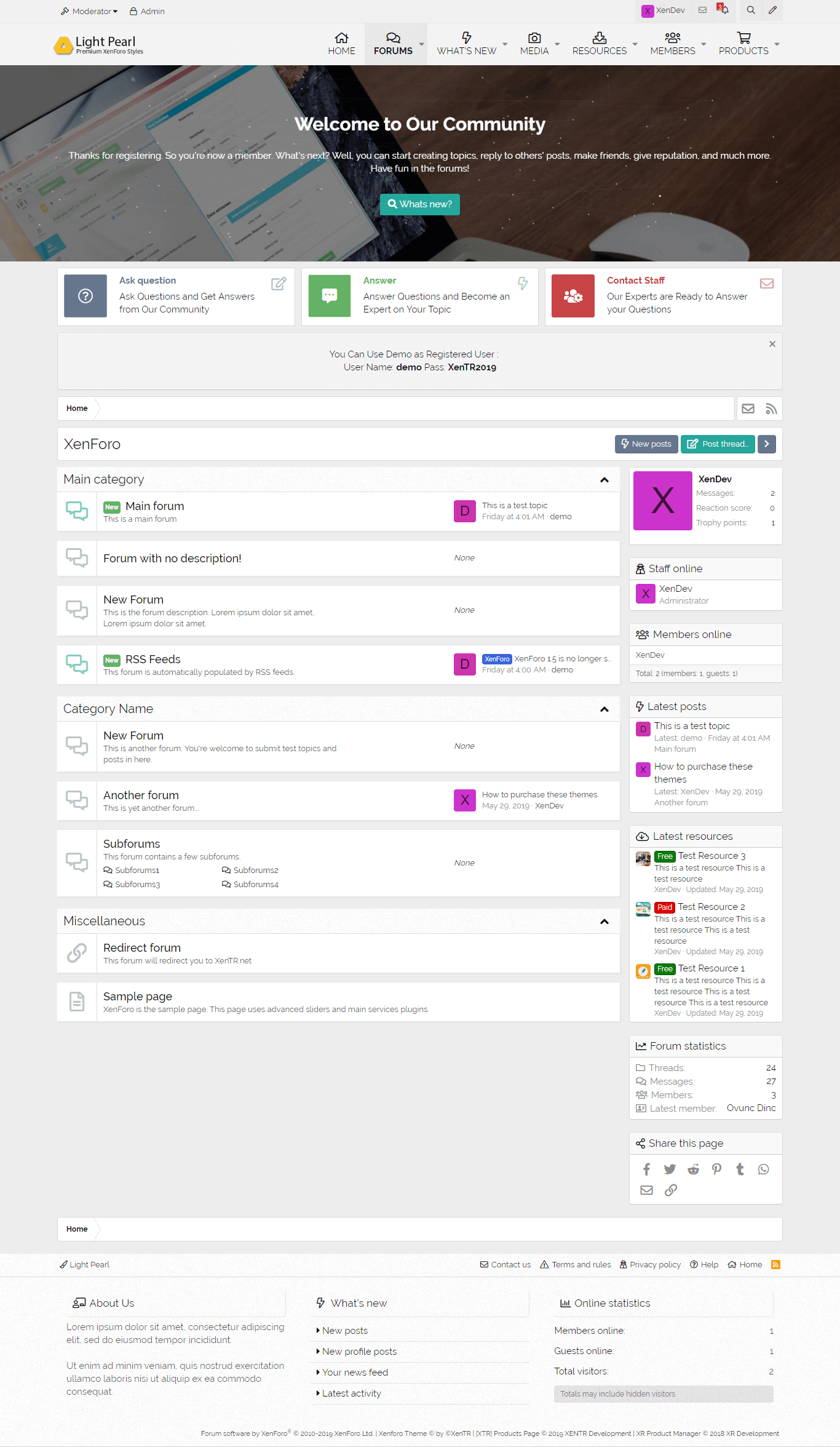
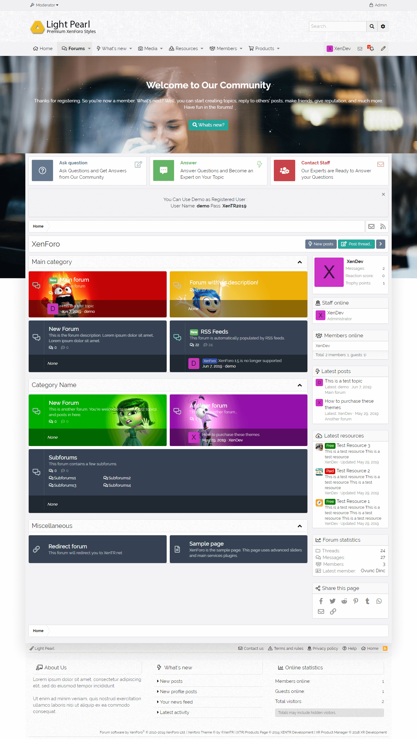
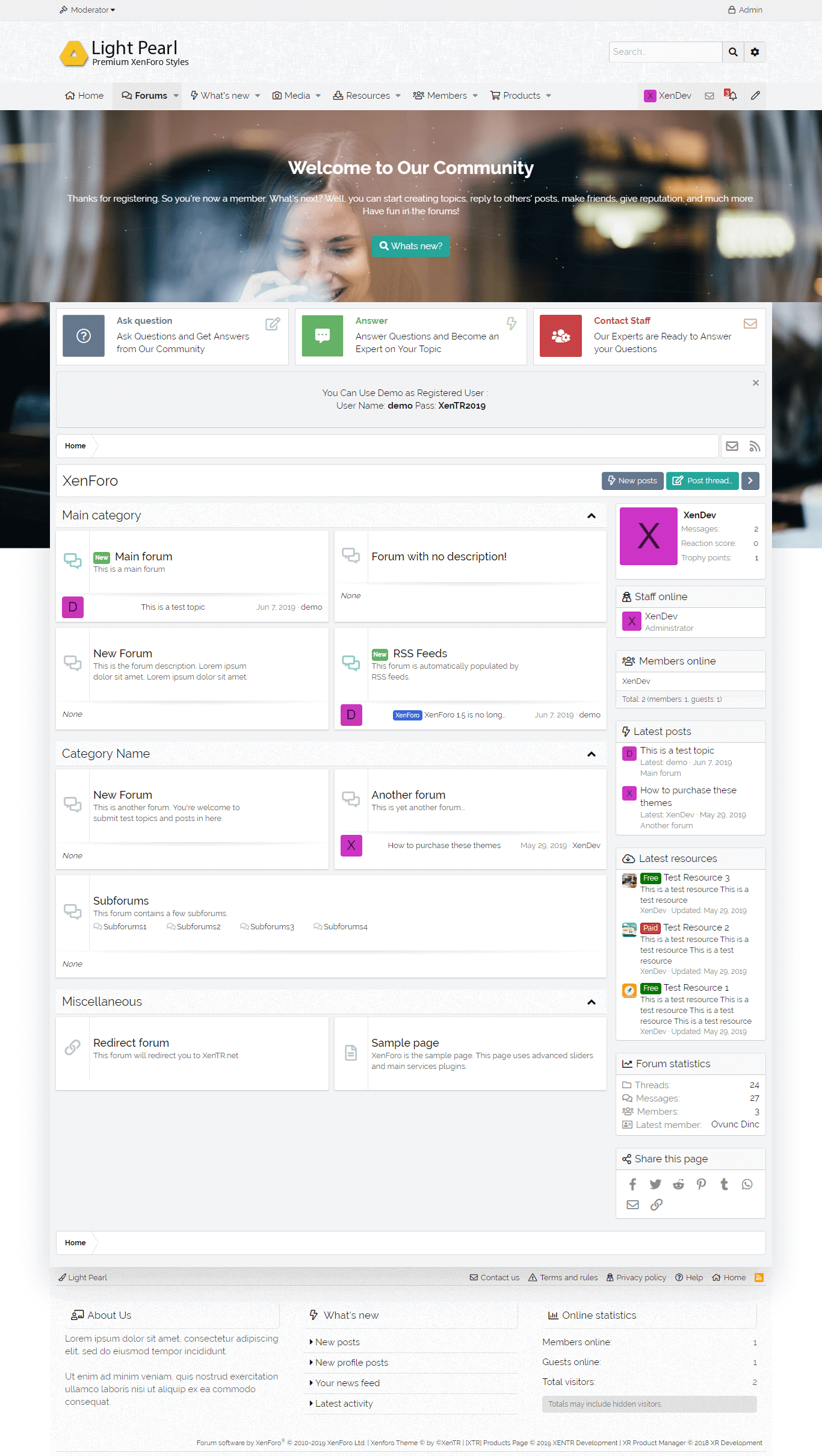
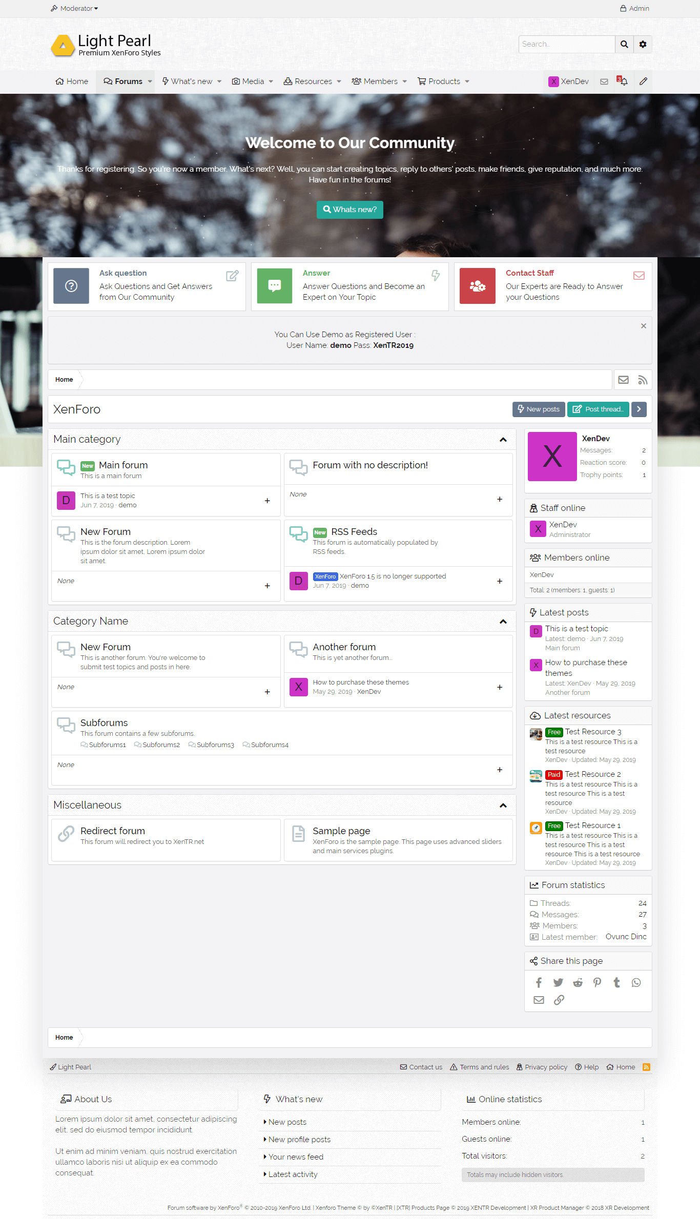
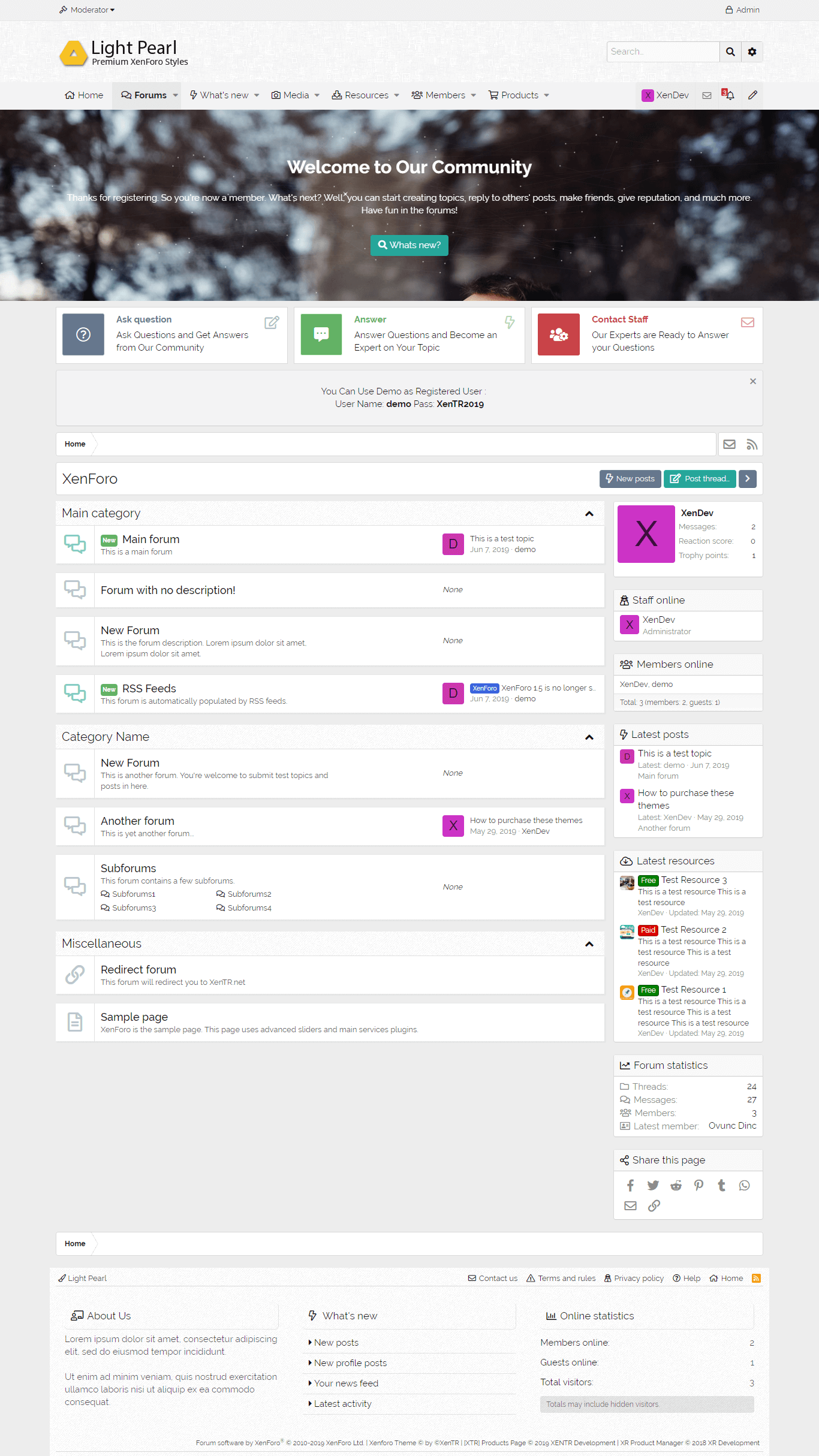
Light Pearl is completely sensitive. Style is designed with a mobile approach. This means that visitors to your website can automatically adapt to different screen sizes regardless of which device they use.
We sure customers will like it much and It looks great on any device and screen .
General Features
- The style features can be selected as Wide and Boxed layout,
- All background colors can be changed easily,
- You can manage to style with many functions can be active or passive.
- With the special background changer, you can easily change the background color and images of your website.
- You can change the position of the user area as you wish and make your formatting for that field.
- In a very simple way you can choose your logo as a Text logo or Picture. You can make your customizations easily.
With different navigation positions, you can adjust the view as desired. - a) Default,
b) Next to the logo,
c) Under the logo
- If you wish, you can choose to use a larger area with the navigation area mause movement.
- You can change the position of the search box according to your own usage format according to your header or navigation options.
- With the Quick Touch feature, you can create a space for your users as you like. This style group is a completely customizable structure.
- With Message Block area, you can create nice welcome message fields for your users. Again this feature is fully customizable.
- You can also offer different views for your users who visit your website with 8 different cancas effects.
- You can set breadth and height options to shape the breadcrumb field in any way you want.
- You can also change the position of the sidebar (Sidebar) field as you can change the sticky (Sticky) position.
- You can also add icons to the titles of these fields and make them foldable. Everything can be easily controlled from the style features. You can also create a different structure by choosing from 2 different visitor panels.

