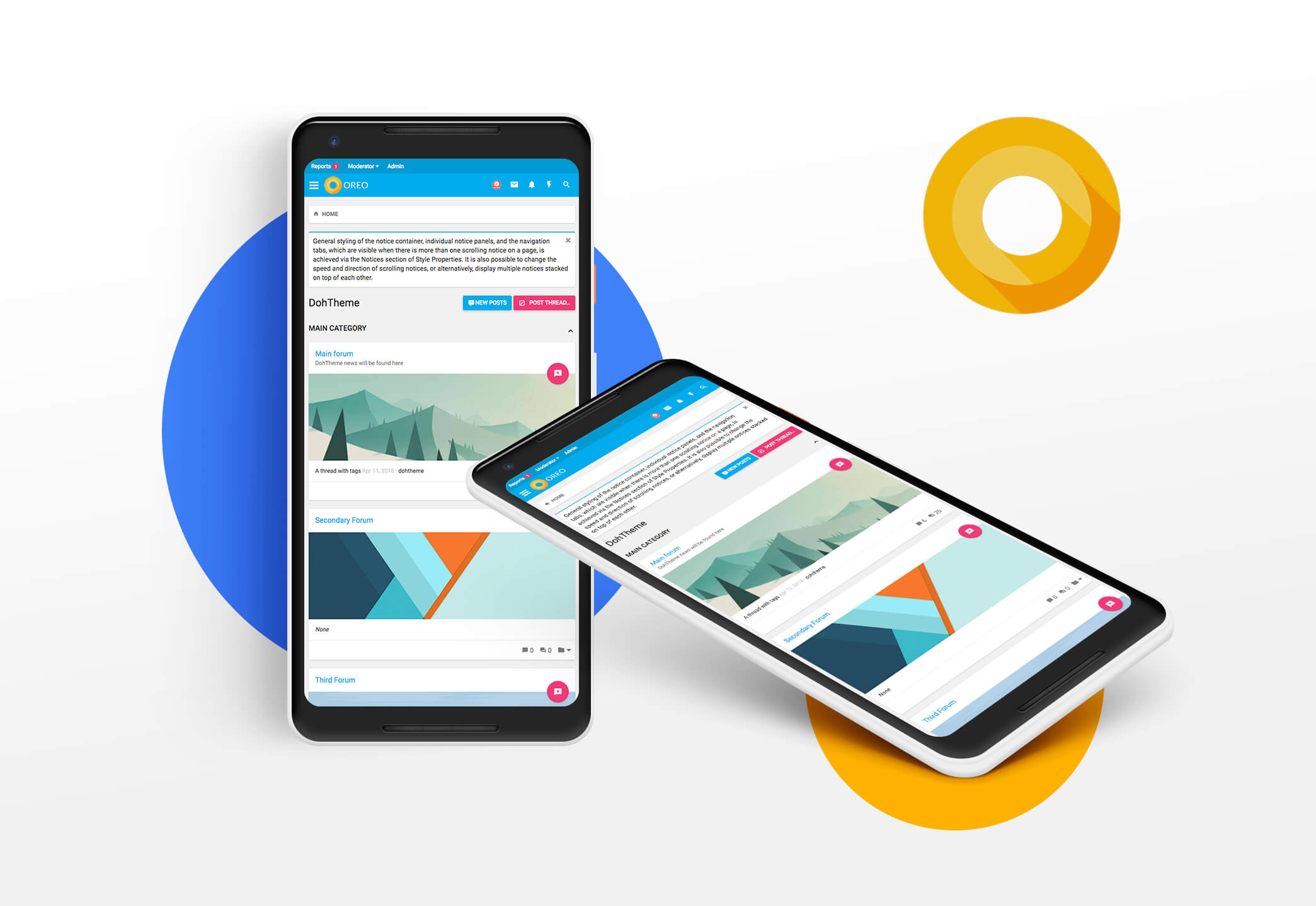
We don’t create the perfect themes; we create a theme that describes your community, making it the perfect one.
Just 5 minutes of playing around with the Features, you will meet your desire fully.

We are proud to launch our new xenForo Theme – Oreo! Oreo has a new layout with a gorgeous look. Every bite of it is beautiful & graceful. It synthesizes the classic principles of good design with the innovation and possibility of technology. This is material design.
A lot of essential features came with Oreo. We wanted to make sure every detail was perfect, so we integrated Advanced Features, Easily Customized style properties to give you the best UX.
Oreo is like other themes, updateable, and there are many more features waiting for you. Just take some time to play around with Oreo. Let’s feel the difference!

The Forum home page has a logical arrangement. The Side By Side nodes helps show more info such as Node Image without messing up the page. You can also put different images for each node.

Material design is basically a result of Google’s set of guidelines for better designing, keeping in mind mobile users. It supports better browsing by enhancing the visual and motion experience. This theme is almost Material-based to make a better user experience.
And much more features
There are many more features waiting for you, take some time to play around with Oreo, and you will see many interesting things!
Full Features:
Just 5 minutes of playing around with the Features, you will meet your desire fully.
We are proud to launch our new xenForo Theme – Oreo! Oreo has a new layout with a gorgeous look. Every bite of it is beautiful & graceful. It synthesizes the classic principles of good design with the innovation and possibility of technology. This is material design.
A lot of essential features came with Oreo. We wanted to make sure every detail was perfect, so we integrated Advanced Features, Easily Customized style properties to give you the best UX.
Oreo is like other themes, updateable, and there are many more features waiting for you. Just take some time to play around with Oreo. Let’s feel the difference!
The Forum home page has a logical arrangement. The Side By Side nodes helps show more info such as Node Image without messing up the page. You can also put different images for each node.
Material design is basically a result of Google’s set of guidelines for better designing, keeping in mind mobile users. It supports better browsing by enhancing the visual and motion experience. This theme is almost Material-based to make a better user experience.
And much more features
There are many more features waiting for you, take some time to play around with Oreo, and you will see many interesting things!
Full Features:
- Fully Responsive Layout
- Clean Retina & HD display Support
- Google Material Font & Icons
- Text Logo
- Collapsible Categories
- Collapsible Sidebar
- Sticky Sidebar
- First Post Unique Background
- Offline status indicator
- Secondary Footer easily customized
- And more........
